A Guest Post by Nick Rains.
 Warning – the following is quite advanced (even geeky) and I must assume the reader has a working knowledge of channels, levels, curves, blending modes, tools etc as well as how the main color models work (RGB, Lab, HSB).
Much has been written about converting colour to Black and White: we all know that there are a great many different ways to do this, some more effective than others. Differences between the various methods are usually explained in terms of visual appeal or the ability to blend the various colour channels to emulate traditional B+W filters. What has not been mentioned is exactly why different greyscale conversions give different results, and more importantly, the fact that this principle can be used to make more accurate adjustments to colour images.
This last point seems quite contradictory; what has greyscale conversion got to do with colour adjustments? Well, quite a lot really when you remember that all RGB colour images are comprised of three different ‘channels’ of greyscale information, each of which represents the lightness values of each of the three colours and that it’s the relationship between them which give us the illusion of ‘colour’.
If you alter a colour image by, say, using the dodging or burning tools, you are actually altering 3 greyscale channels at the same time and unless the relationship between those 3 channels stays exactly the same, there will be a shift of hue or saturation which is of course not the aim of the adjustment. Many of Photoshop’s tools, used at face value, operate on a composite of all three channels – not an ideal situation.
How we see Luminosity
Photoshop very rarely uses the term Luminosity. It is not Brightness in the Hue, Saturation, Brightness (HSB) colour model. It is not the Lightness channel in Lab mode and it is not the K value when you use the colour picker in Greyscale mode.
Luminosity is the perceived brightness of a colour, not it’s numerical or measured value under the above colour models. Look at this image – 3 patches of full strength RGB. Each has a 100% Brightness and a 100% Saturation, all that differs between them is the Hue. However, I think all would agree that the green is perceptually lighter, or more luminous, than the red which is in turn lighter than the blue. So, whilst the numbers show a 100% Brightness, you see quite different tones.
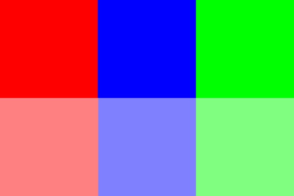
Here is the same image converted to B+W using Image > Adjust > Desaturate. All the colour contrast disappears because the Hue (colour) is removed and the new lightness of the greys in the top row is exactly 50% (127) because the Saturation and Brightness are both equal.

Here is the image converted another simple way : Image > Mode > Greyscale. This is better because the conversion is a little more like our eye sees colour with an emphasis on the Green. In fact the colour weighting is very close to 60%G 30%R and 10%B where the Green lightness as double that of the Red, much like our eyes see and tipping a nod to the fact that there are double the number of Green sensels on a camera’s Bayer array as compared to Red and Blue. The conversion still looks a little lacking in contrast however, and good B+W images really need good impact or contrast to look their best.
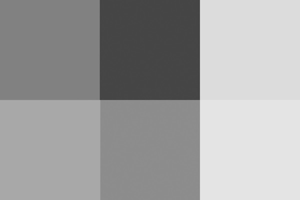
Even the Lightness channel in Lab, shown below, does not really depict the relative tones of the colours as we experience them. It is actually a lot closer to the perceived luminance but is perceptually ‘lighter’ overall than the simple Mode > Greyscale conversion.
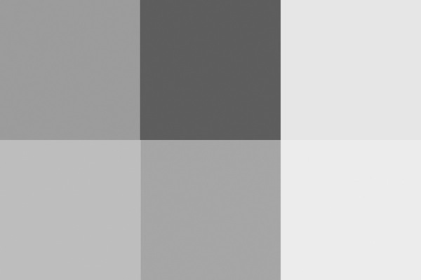
The most accurate conversion is via the Channel Mixer using these values taken from the sRGB definitions developed by Hewlett Packard (http://www.w3.org/Graphics/Color/sRGB)
71%G 21%R and 8%B.
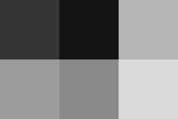
This gives a slightly more punchy look and it is a good starting point for converting your images to B+W. The Red looks a little dark to my eye, and the Blue a bit dark, but since there is very little pure colour in nature, this combination works well in the real world.
So why the fuss? Why do we need to know all these different methods?
The point to understand is that when you are removing colour information and having your image rely only on greyscale tones you need to control how those tones relate to one another. Do you want the blue of the sky to become a darker greyscale tone than the green grass? Or vice versa.
As an example, for the Australian flag – which greyscale version looks better?
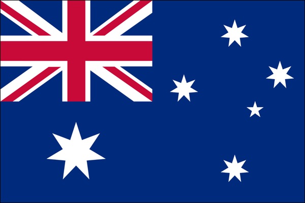
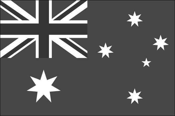
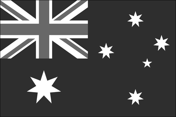
There is no definitively correct answer – it’s the one which looks best. Personally, I think the one with the darker blue looks best because it maintains the perceived brightness of the blue as well as keeping good contrast between the blue and the red.
You need to take control and make sure the colours in the original capture translate to good meaningful contrast in the B+W version. This is the secret of good B+W conversions – not the precise method, but being aware of the tonal distributions and which greyscale value a colour is converted to relative to the other colours’ subsequent greyscale values.
Just to leave you with an advanced ‘teaser’…
What if you duplicated a colour layer and added a monochrome channel mixer adjustment layer to that new layer? You could then change the new layer’s Blend Mode to Luminosity and use the Channel Mixer to adjust the Brightness and Saturation of the colours in the image without affecting the Hue in any way.
If you try doing this directly with Curves or Levels you’ll get a small Hue shift as you adjust the Brightness and Saturation. If you don’t believe me try setting the Info Tool to HSB instead of RGB and read off colours as you make a direct Curves adjustment. You’ll see all three numbers change, including the Hue.
I’ll discuss this further in a future article.
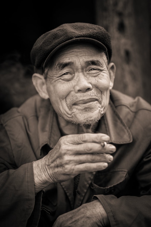
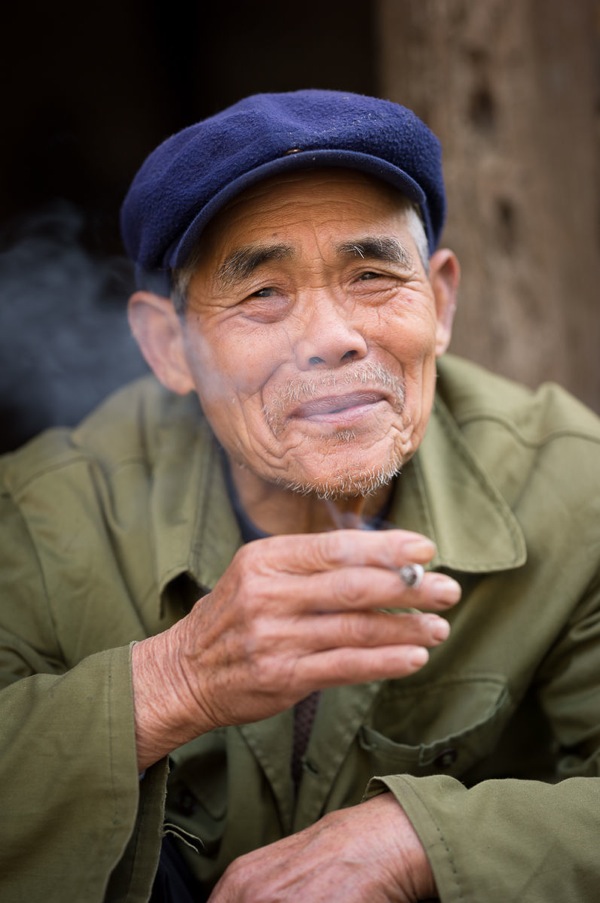
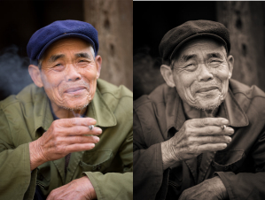
In converting to B+W the green of the jacket and the blue of the cap have darkened whilst the red skin tones have slightly lightened. The face and hands now stand out far better – a good example of a situation where the colours in the original were simply a distraction, adding nothing to the shot, and so were removed.
Nick Rains is a Queensland based photographer who has been shooting professionally since 1983 and has seen first hand many changes in the photographic industry, from manual to auto focus in the late 1980s through to the shift to digital in the past decade or so.
Nick currently shoots feature work for companies like Australian Geographic and Orion Expeditions as well as writing for magazines and blogs around the world. Nick is both a Canon training consultant and a Leica Ambassador, as well as a Master Photographer with the AIPP and a national judge. You can see more of his work at www.nickrains.com or add him to your circles on Google Plus.
For more in-depth photography writing, try Nick’s iPad app “Photique”. It’s a free download.
Post originally from: Digital Photography Tips.
Check out our more Photography Tips at Photography Tips for Beginners, Portrait Photography Tips and Wedding Photography Tips.
Black and White Conversions: An Introduction to Luminosity
via Digital Photography School http://digital-photography-school.com/black-and-white-conversions-an-introduction-to-luminosity?utm_source=feedburner&utm_medium=feed&utm_campaign=Feed%3A+DigitalPhotographySchool+%28Digital+Photography+School%29
These black and white photography is just wow. I like your photography. Also. Your sharing tips is most valuable for beginners. Many many thanks for your valuable sharing.
ResponEliminabackground removal service