One of my favorite features of Adobe Photoshop Lightroom is the user interface. More specifically, the ability of the user interface to mold itself to the activities at hand, and its ability to get out of the way when I don’t need it. This is especially useful when you just want to review your photos, as large as possible, without any interface clutter.
In today’s tip, we’ll look at the various parts of the Lightroom interface, and the ways you can control their appearance – or disappearance, as it were. The Lightroom interface has a few main sections, as shown below:

- The image display area
- The left panel
- The right panel
- The toolbar
- The filter bar
- The module picker / identity plate
As we’ll see, we have the ability to show or hide each of these, and when you’re working on a small screen (or simply wan to see your images as large as possible) it is important to have visible only the interface controls that you absolutely need.
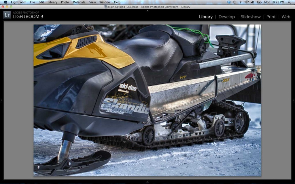
For example, here we have Lightroom displaying a recent import, and after making some preliminary picks, I’m ready to go back and select the best images for further processing. If I switch into Loupe mode in the Library module, I have this result:

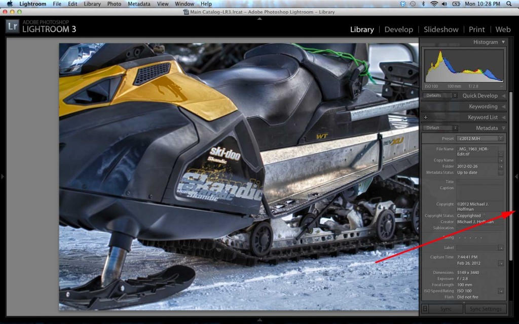
Notice that in Loupe mode, the filter bar is no longer visible. It’s still there in grid mode, though, but you can turn it on or off with the keyboard toggle ‘\‘ (backslash). However, the image is still surrounded by panels and bars – and we can turn these off as well.
We can toggle the visibility of the Toolbar at the bottom of the screen by r=pressing ‘T‘. This is better, but we have a way to go:

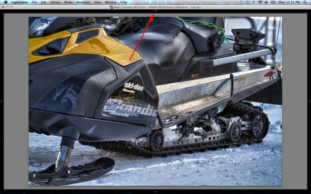
Let’s tackle the side panels next. There are a few tricks to working with the side panels, and the first is the ‘Tab‘ key – this toggles visibility of the side panels each time you press it. If we click Tab, we now have a much larger view of our image:
This is good! But, before we move on, a word about the side panels – notice the very slim black bars in the left and right margin of the window? There is a triangle in each bar, and there are two options for showing one side panel at a time:
1. Move the cursor onto the black bar, and the side panel temporarily slides into view – without resizing the image. While the panel is open, you can make selections, adjust sliders, and so forth, and when you move the cursor off the panel, it slides back out of the way.
2. Click the triangle in the center of the black bar, and that side panel opens (resizing the image in the process). Note that the triangle changes direction. Clicking it again will hide the panel and resize the image once again.

We still have some area at the top of the screen taking up room – the module picker and identity plate area. If you look closely at the top center of the screen, you’ll notice another small triangle – clicking this collapses the module picker area, revealing even more screen and allowing an even larger image display:
Now, the image is taking up almost all of the screen. But wait, there’s a bit more! We are looking at the normal view. We can press the “F” key to toggle from Normal view to “Full Screen with Menubar:”

And, we can toggle again to view in “Full Screen” (no Menubar):

At this point, we have the image as large as possible. However, all the Lightroom keyboard commands are available (if you are a keyboard shortcut type of person). You can select, rate, delete, and move through your images with keyboard commands, while the interface is out of sight (but waiting to appear at a moment’s notice).
As a final and ultimate way to eliminate the last of the clutter, press “L” to go into Lights Dim mode, then “L” again to go into Lights Out mode. Nothing but your image showing now! “L” again turns the lights back on.
As a final shortcut to remember, Shift-Tab hides and reveals ALL the panels at once. This is the ultimate power shortcut!
Commit these simple shortcuts to memory. Learn to hide the parts of the Lightroom interface you aren’t using or don’t need, and you’ll enjoy a much better experience as you’re working with your photos.


Comentaris
Publica un comentari a l'entrada