It is often said that photography is a visual language. Through our photographs we tell stories, share experiences, and communicate emotions. Aside from journalism, where faithful captures are important for ethics reasons, photography is often about creatively interpreting a scene, rather than simply recording what is in front of the lens.
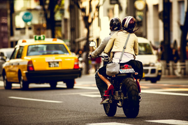
Tokyo street scene with creative color
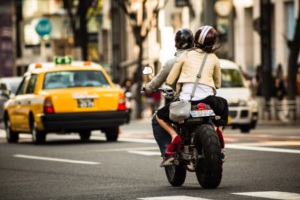
Tokyo street scene with 'normal' color
Creative use of color can be a powerful tool for controlling the mood in your photographs. In a series of three posts I will discuss three Lightroom controls that can be used to control color and mood in your photos:
1. White Balance
2. Split Toning
3. Tone Curve
In this first article in the series I will discuss white balance, the simplest of the three tools.
Note: I shoot Raw and import my photos into Lightroom, converting to DNG on the way into Lr. Shooting Raw gives me much more flexibility to make creative color decisions in post processing. The screenshots from are from Lightroom 4, but with the exception of the Tone Curve technique that I will cover in Part 3 of the series, these techniques can be used in previous versions of Lightroom.
White Balance
White balance allows you to control the overall color temperature of your image, and adjust for different light sources like tungsten, daylight, flash, etc. If you’ve never heard of white balance take a look at this post.
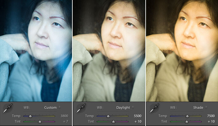
Example of different white balance settings
Most of the time you’ll read that white balance is there to help you get accurate color in your photos. This article is not about accurate color. For the next few minutes, forget about accurate color and let’s just look at how white balance can be used to change the mood in a photo. I like to think of white balance as just another tool for controlling color image my images. Thinking of white balance this way is liberating and encourages experimentation.
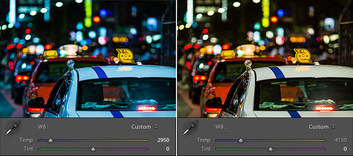
Tokyo Taxi White Balance Example
Notice how a cool white white balance creates a totally different mood than a warm white balance for the same scene? Which of the above images do you prefer? When you feel like getting creative with your images, try shifting the white balance either cooler or warmer for creative effect.
I hope this article has encouraged you to think creatively about white balance, and to experiment with shifting white balance for creative effect. I love hearing your feedback, please comment below or feel free to connect with me through Facebook or Google+.
In Part 2 of the Creative Color series I will discuss Spit Toning, and demonstrate how white balance and split toning used together for even more creative control over color.
Post originally from: Digital Photography Tips.
Check out our more Photography Tips at Photography Tips for Beginners, Portrait Photography Tips and Wedding Photography Tips.
Creative Color Processing (Part 1/3 – White Balance)
via Digital Photography School http://digital-photography-school.com/creative-color-processing-part-13-white-balance?utm_source=feedburner&utm_medium=feed&utm_campaign=Feed%3A+DigitalPhotographySchool+%28Digital+Photography+School%29
At first, thank you sharing for your valuable information. This information is very important and useful for all of us. These play an important role in our various needs. Hopefully, we will get more important theories. Again, thank you very much.
ResponEliminahow to remove clothing wrinkles in photoshop