There are quite a few properties in CSS that take a length as a value. The box model properties are the obvious ones: width, height, margin, padding, border. But plenty of of others as well: the offset and sizing of a box-shadow or the size and spacing of fonts. What are all the accepted "length" properties in CSS? There are quite a few.
The Absolute Lengths
px
.wrap {
  width: 400px;
}
Pixels are perhaps best thought of as "device pixels" as this length doesn't have anything to do with the literal screen pixels in the display you are looking at. It's actually an angular measurement.
It is supposed to be a value that is normalized across devices and displays, but that increasingly isn't true anymore. For instance, websites on the iPad mini render the same as on the iPad, meaning if those values were set in pixels that normalization is rather out the window.
Pixels are still a canonical measurement on the web though as they are consistently handled, many other lengths map directly to pixels, and JavaScript speaks in pixels.
in
.wrap {
  width: 4in;
}
Inches are a physical measurement, but in CSS land, they just map directly to pixels. Feel free to chime in with use cases in the comments and I'll add them here, but I have never seen a practical use case for this or the rest of these physical measurements.
1in == 96px
cm
.wrap {
  width: 20cm;
}
For most of the world, centimeters are more familiar and useful as a physical measurement. They also just map to pixels:
1cm == 37.8px
mm
.wrap {
  width: 200mm;
}
And an order of magnitude smaller...
1mm == 0.1cm == 3.78px
The Font-Relative Lengths
Em
.wrap {
  width: 40em;
}
A relative unit. Originally a typographic measurement based on the current typefaces capital letter "M". Although the length doesn't change when you change font-family, it does change when you change the font-size.
Without any CSS at all, 1em would be:
1em == 16px == 0.17in == 12pt == 1pc == 4.2mm == 0.42cm
If any CSS changes the font size (at any level in the document), 1em becomes whatever the new font-size is.
Making things a tiny bit funkier, em units multiply upon themselves when applied to font-size, so if an element with font-size 1.1em is within an element with font-size 1.1em within yet another element with font-size 1.1em, the resulting size is 1.1 ✕ 1.1 ✕ 1.1 == 1.331rem (root em). Meaning even if an element is set to, say 10em, that doesn't mean it will be a consistent width everywhere it appears. It could be wider or narrower if the font-size changes (see proof).
Rem
.wrap {
  width: 40rem;
}
A relative unit, like em, but it is always relative to the "root" element (i.e. :root {}) rather than using the cascade like em does. This vastly simplifies working with relative units.
Notable browser support issues: doesn't work in IE 8, Safari 4, or iOS 3.2.
Points
.wrap {
  width: 120pt;
}
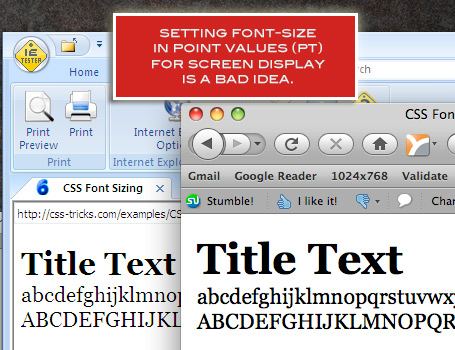
A point is a physical measurement equal to 1/72 of an inch. Points is the most common way to size type outside of CSS (likely why it is supported in CSS). It's still common in language "Of course they set this important information in tiny eight point type!".
Points make the most sense in print stylesheets for sizing type, where physical media in involved, but there is nothing preventing you from using pt for screen media or anywhere else a length is accepted.
Notable browser support issues: There used to be big differences in on-screen rendering of pt size. Here's a comparison of IE 6 vs Firefox (probably 3.6).
Pica
.wrap {
  width: 12pc;
}
The same story as points, only 1pc == 12pt.
ex
.wrap {
  width: 60ex;
}
This is a measurement based on the x-height of the current font. Sometimes that comes from information embedded in the font itself, sometimes browser figure it out by measuring a lower case glyph, and worst case, it's set to 0.5em. It is named "x" height because it is supposedly based on the height of the x character. To understand x-height, think of a lowercase character that as a bit that sticks up (ascender) like a lowercase "d". The x-height doesn't include that ascender, it is the height of the lower loop part of that character.
Unlike ems, which don't change when you change the font-family, ex units do change when you change the font-family, as the value of one unit is specifically bound do that font. (proof).
ch
.wrap {
  width: 60ch;
}
This is similar in spirit to x-height, only ch is based on the width of the zero (0) character instead of the height of the x character. It also changes as the font-family changes.
Notable browser support issues: No WebKit-based browser support at the time of this writing.
The Viewport Percentage Lengths
vw
.wrap {
  width: 10vw;
}
This is the "viewport width" unit. 1vw is equal to 1% of the width of the viewport. It is similar to percentage, except that the value remains consistant for all elements regardless of their parent elements or parent elements width. A bit like how rem units are always relative to the root.
Sizing type is the major use case here. See Viewport Sized Typography.
Notable browser support issues: No support in any mobile browsers except the very latest iOS 6. This goes for all the viewport related length units.
vh
.wrap {
  width: 10vh;
}
This is the same as the vw (viewport width) unit only it is based on the viewport height instead.
vmin
.wrap {
  width: 20vmin;
}
This value will be whichever is smaller at the moment, vw or vh. In the standard use case of sizing type, this may be a more useful metric than vw or vh on their own in determining true screen size.
vmax
.wrap {
  width: 20vmax;
}
This value will be whichever is larger at the moment, vw or vh.
Notable browser support issues: WebKit based browsers support vmin but not vmax (yet). Firefox does support vmax though.
Odd Ball Out
Percentage
.wrap {
  width: 50%;
}
A length set in percentage is based on the length of same property of the parent element. For example, if an element renders at 450px width, a child element with a width set to 50% will render at 225px1.
Trivia: percentage isn't technically a length unit, but I'm including it here since it is so related.
More Information
What is supported in your browser?
Check out this Pen!
1Assuming the child element isn't inline-level or a table cell with some weird table-y stuff going on, or a flex child or grid cell or any other fancy wacky stuff.
The Lengths of CSS is a post from CSS-Tricks
via CSS-Tricks http://css-tricks.com/the-lengths-of-css/
Comentaris
Publica un comentari a l'entrada