Living in the north of England, I gotten used to shooting on cloudy days, obviously I’d love it if we had blazing sunshine every day, but when it comes to weather, you have to work with what you’ve got. I recently took a trip out to the Peak District National Park with some friends, and lo and behold, it was cloudy, but that didn’t stop me from being able to take some exciting images.
I’m going to take you through a series of images that I took that day, displaying the original unedited jpeg and then the final RAW version, explaining the circumstances of the original shot and the process that I went through to end up with the final version.
There are certainly inequalities in my work, but I wanted to openly show you the processes that I went through in order to show you how pitfalls can be avoided and how sometimes you can be surprised by what is achievable in uninspiring conditions using minimal equipment.
1. Getting Started
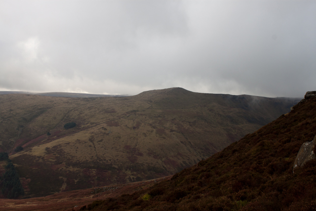
Shooting Image One
This isn’t really the sort of view that you’re after when you first head out on a shoot, the clouds rolling over the edge of the hills on a very dull and damp day. I was travelling light, we set off late and had a lot of walking to do, so I simply packed my DSLR and a 28mm prime lens.
If the conditions had been different, I would have packed more lenses and a tripod at least, but I didn’t have high hopes, so just thought I’d take my camera in case the weather did decide to change.
Post Production of the First Image
This may not be the most stunning of images, but it does begin to portray the atmosphere of the scenery that day. The clouds certainly add drama and depth to this image, as the layers overlap one another. In post, I looked to maximise the tones in each third of the image.
I wanted to ensure that a small amount of detail could be seen on the right in the foreground. I also boosting the purples slightly to bring out the small patches of heather dotted around the hillside. I also added a touch of blue to the clouds to contrast with the yellows, greens and purples of the landscape, which heightens the impact of the brooding clouds.
2. Searching for Inspiration
Shooting the Second Image
At this point, I was struggling to find anything exciting in the landscape to work with, the views across the valley looked dull and lifeless and vast layers of flat cloud weren’t offering much to enhance that. I was trying to find other points of interest to work with.
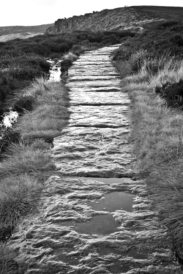
One of the best things about cloud cover is that it acts as a huge natural softbox for the sun, which means that the light from the sun is evenly dispersed. This can be extremely useful for portraiture (we’ll come to that later), and was just right for this shot of the pathway leading off into the distance.

Post Production of the Second Image
In hindsight, this isn’t an amazingly interesting image, but for these purposes, it works as a good example to highlight the way in which cloud cover can be beneficial. The light is falling evenly on the variety of surfaces.
I’ve converted the image to black and white in post, which brings attention to the variety of textures within the image without the distraction of colour. Soft light inherently lessen contrast. Attempting to raise contrast in color can destroy an image, but working in black and light give you more room to boost it without making things look unnatural.
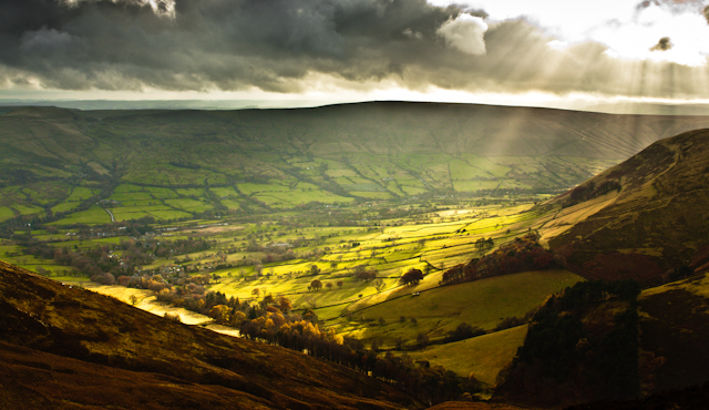
3. Breakthrough!
Shooting the Third Image
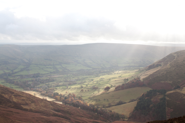
As we ascended towards the top of our first peak, we kept stopping to turn and take in the view behind us. The sun was trying it’s best to break through the clouds and I could tell that before long the dull grey of the clouds would be overwhelmed with light.
This scene didn’t last for long, but as the sun finally shone through the clouds the visible rays of light fell onto the valley below us. It was at this point that I wish I’d packed my graduated filter, as it was very difficult to set exposure for both the landscape and the sky, so I tried to find a happy medium within which the sky was not completely blown out.
Post Production of the Third Image
This image was hard work in post. I wanted to maximise the sun rays without diminishing from the image as a whole. I didn’t actually touch the rays at all, I just worked on everything else around the image.
I brought down the exposure slightly, bumped up the saturation and the contrast. I worked with the colours slightly to add warmer greens and yellows, again, to maximise the impact of the light on the valley.
Without the clouds, this image wouldn’t be anything of note. The fact that the clouds allow the sun’s rays to burst through in that fashion while also adding that drama of the brooding darkness gives the whole image it’s excitement.
4. Composing Using Clouds
Shooting the Fourth Image
With this image, I broke the scene before me into thirds, so I’ve a third foreground, a third of the valley leading up through the hills on the opposite side and then a third of the sky. For me, the most interesting elements of this shot are the light and clouds. As your eye is lead through the image, it’s drawn to areas of the shot that are highlighted by the sunlight that’s broken through the clouds.
The clouds themselves then offer a completely different texture to the rest of the image, that begins in the foreground with stoney rock formations and gradually progresses until reaching the perceivably fluffy cloud formations above.
Post Production of the Fourth Image
In order to reveal the cloud formations in the image, I applied a graduated neutral density filter in post, which blocked out some of the unwanted light in the sky to reveal the detail of the clouds and the variety of tones.
I wanted to maximise the variety of surfaces and textures within the shot, hence the black and white conversion. This also emphasises the strong contrast in the foreground, which due to the soft and even light fades through the image.

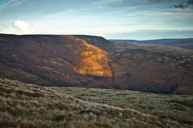
5. Unexpected Interest
Shooting the Fifth Image
When taking this image, I wasn’t expecting great things, I was simply trying to capture the view as we made our way down the hillside. It was the same view that we’d seen for the last hour or so and I felt I’d certainly taken better images of the same view already.
However, when it came to post processing, the clouds revealed themselves to add a depth and drama to the image that would have otherwise been absent.
Post Production of the Fifth Image
Like a few of the images from this shoot, I added a ND Grad filter to the sky in order to block out excess light, but this time around, that dark brooding cloud revealed itself at the forefront of the image. It’s so close you want to reach out and touch it.
The contrast between the darkness of the clouds and the fresh and inviting pastures of the valley below is what makes the image for me. I did do some work on darkening the clouds to enhance that contrast. But for the most part, the fading light is the main culprit for the level of interesting elements within this image.

6. A Glimpse of Light
Shooting the Sixth Image
To be able to get this sort of shot, you need to be aware of what’s going on around you. We were on our way down the mountain and as it had been doing for the last hour or so, the light was breaking through the clouds, casting patches of light upon the landscape.
I think this might be my favourite image of the set. The way that the light correlates so perfectly with the lines in the landscape tell me that I shot it at just the right time.
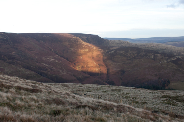
Post Production of the Sixth Image
Working in post on this shot was a lot of fun. I added a faint vignette which draws the viewers eye into the centre of the shot where the main focal point, the light, is placed.
I toned the sky slightly blue and upped the oranges and greens in the landscape to contrast the sky. The variety of sparse clouds lead you into the distance, and even though there’s not many clouds in this shot, without the cloud cover, that area of light that makes the photo what it is wouldn’t have been there.
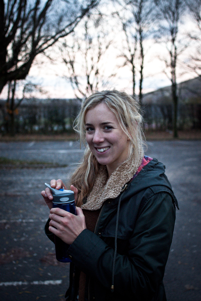
7. Maximising Cloud Cover for Portraiture
The First Portrait
I wanted to give a couple of examples of how useful cloud cover is for portraits. You’ll have heard or read that you shouldn’t shoot portraits on bright days. That’s because the harsh light is so difficult to work with, but when it’s cloudy the soft and even light offers the perfect conditions to capture a great portrait shot.
I took this first shot in the car park once we’d returned from our adventure. It’s a very simple image, but there’s something about the tone, due to the dimming light that gives it a very interesting atmosphere. Again, I’ve added a slight vignette to draw the eye towards the face and I’ve upped the clarity to add some strength to the image.
The Second Portrait
This second shot was taken by my wife, and so I can’t claim any kudos for it, but she’s managed to use the cloud as a backdrop for the portrait. The variation in tones across the sky gives enough interest without commanding your attention and the even spread of light means you can just about see enough of the subjects features.

What You Can Take Away From This
Hopefully you now have a greater appreciation of the photographic opportunities that a cloudy day can offer. There’s so much potential both in landscape and portraiture settings to work with natural light on a cloudy day.
With the enviable flat light, dramatic cloud formations and light bursting through the clouds onto the landscape below. I’d hate to think that anyone would discount a chance to take photographs because it’s cloudy, so get out there and see what images you can make!
Remember that colors can be boosted, and if they can’t black and white is a great solution to contrast problems.
via Phototuts+ http://photo.tutsplus.com/tutorials/shooting/how-to-take-brilliant-photos-on-a-cloudy-day/?utm_source=feedburner&utm_medium=feed&utm_campaign=Feed%3A+Phototuts+%28Phototuts%2B%29
Comentaris
Publica un comentari a l'entrada